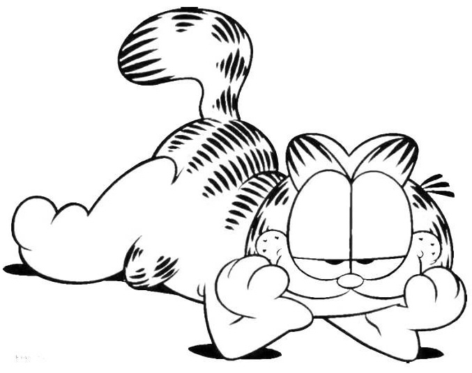
My first clear memory of drawing was second grade, in the early ’80s, copying Garfield comics. The jokes were clever and funny, but I was really studying Jim Davis’s technique, the consistent line weight, the hard hatching for shadows, and how deliberate every mark was. I drew Garfield over and over until I figured out the formula.
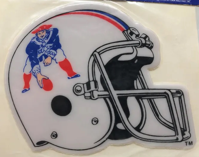
That same impulse drew me to logos and illustrations: BMX and skateboard brands, NFL and baseball teams, and those 3D NFL helmets that were everywhere in the ’80s. I recreated them as precisely as I could, chasing that same clean, definitive quality where every curve felt resolved.
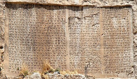
Around that time, I also started reading about Sumerian cuneiform and Egyptian hieroglyphs. I was less interested in the history and more fascinated by the cryptography, the idea of a mark that carries meaning only a few people can decipher. I wanted to create symbols with hidden things inside them.
In the summer of 1987, just before going into the 8th grade, I discovered skateboarding. I started taking the bus into Lowell, the biggest city near where I grew up in Tewksbury, Massachusetts and two new worlds opened up at once. First the board graphics, a whole visual language attached to the sport. Then graffiti. Once I noticed tags I started seeing them everywhere: names compressed into marks, designed to be read only by those in the know. It hit the exact same nerve as the logos and hieroglyphs.
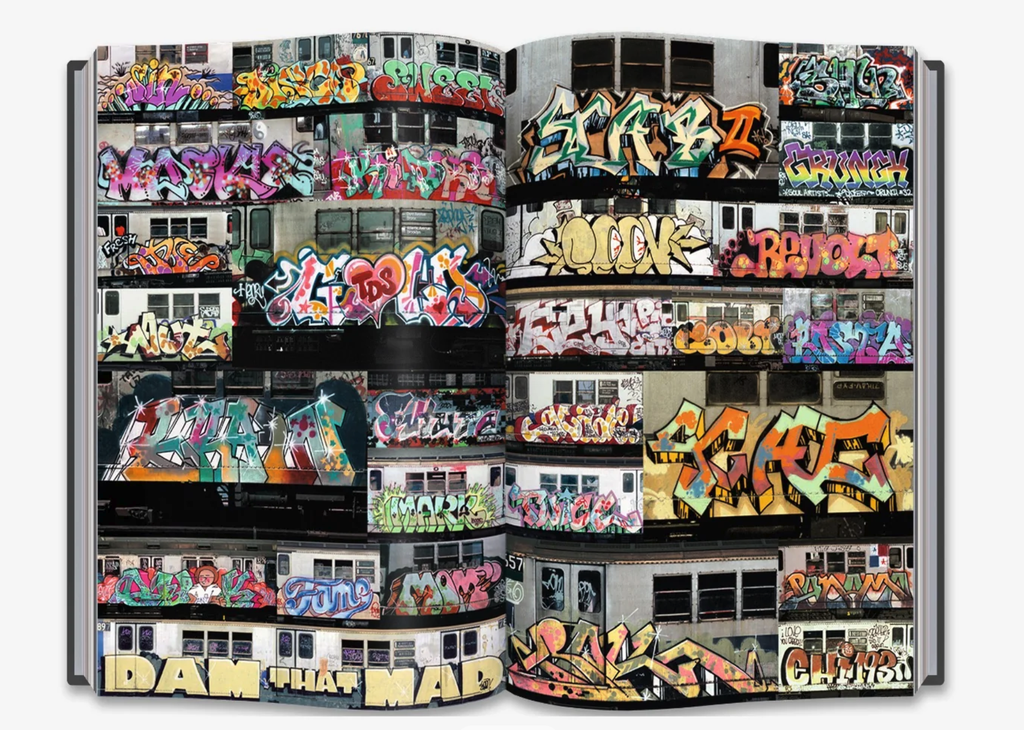
It was later that same year I started taking the commuter rail into Boston to skate. For the first time, I was seeing full graffiti pieces and productions. Everything I’d been chasing individually suddenly came together in one place: logo construction, sharp forms, typography, and letters hidden inside letters.
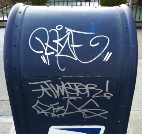
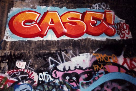
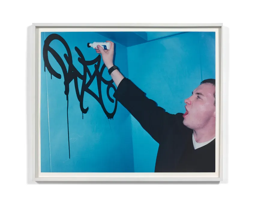
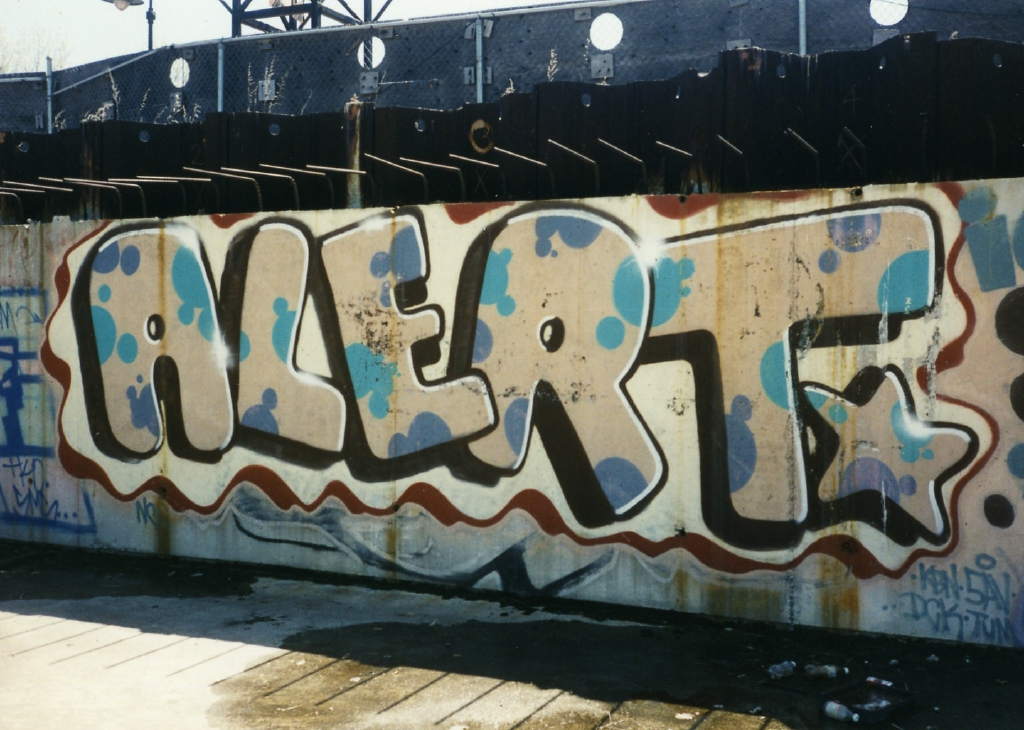
Hip hop was already part of my life through MTV, roller-skating, and breakdancing. Movies like Breakin’ and Beat Street had shown me real graffiti, but what I was seeing in Boston felt like a gateway into the art itself. I bought Subway Art and studied it like a manual. I started tagging first, then spent the rest of high school learning how to actually use spray paint.
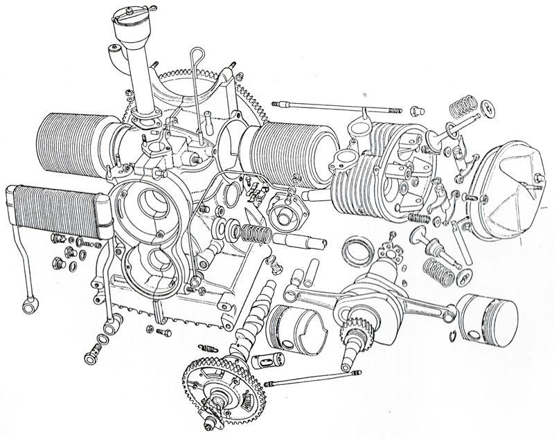
Choosing a high school came down to a tour of the local vocational school. I walked into the Technical Illustration and Commercial Art shop and saw student-drawn exploded views of car parts done in technical pen. I knew immediately that was where I belonged. We spent full days and week-long blocks in that room learning illustration, design, screen-printing, sign painting, and fine art. I still view that shop as a fundamental foundation for my creative life.
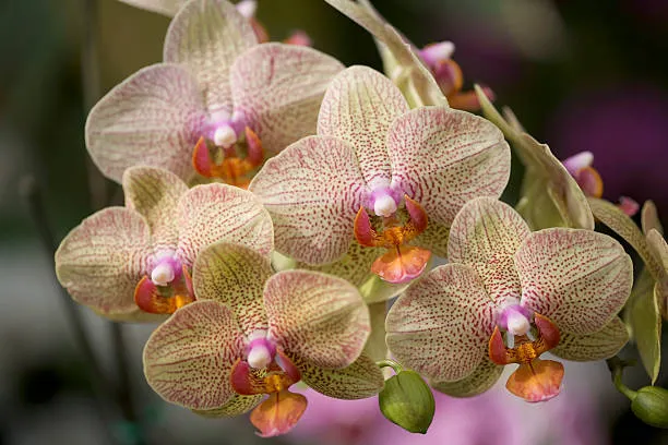
During that time, painting still life studies made me pay closer attention to the design inherent in nature. Flowers became a main subject, which eventually led to orchids. I was drawn to their symmetry and the way they resembled alien technology. That brought me to insects, which have remained a constant in my work ever since. The human face hooked me for similar reasons: the realization of how little a line needs to shift to completely change an expression, turning one emotion into its opposite with just a few degrees of angle.
Years later, a friend who studied sacred geometry, Celtic art, and comparative religion looked at my work and started pointing out specific mathematical alignments. I’d been arriving at them purely through intuition, without realizing they had formal names. That realization reshaped how I viewed my past work and influenced where I took it next.
All that early training made my line work rigid and technical, which was my goal at the time. My looser, more recent work is an effort to break out of that discipline, trying to find spontaneity and freedom in a hand I spent years training to be exact, letting the lines go where they want. Day to day, I work as a graphic designer in Portland, Maine. Ratio is where I share the work that sits outside that structure: artwork, prints, music, experiments, and ongoing creative projects. It’s a place where all the influences that shaped me continue to overlap, evolve, and find new forms.